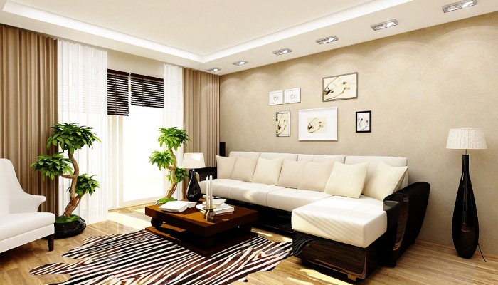
Living Room Décor Mistakes
Rachel Chudley, a renowned interior designer and popular for using solid colors, claims that choosing room colors is incredibly challenging since people only understand the truth of things because it only sits next to another color. We now comprehend the color theory better, and it’s understandable why people played it safe for many years.
The six living room color mistakes below will help you understand the best color combinations and trends and how to choose a living room color for this important room in your home.
1. The Assumption that You Have to Pick Cool Colors in a Living Room
Advancing or dark colors can work within small spaces, and suggesting otherwise makes it a myth. These colors typically appear to be approaching you and include warm tones like violet, red, yellow, and orange. They’re pretty firm and make your living room appear intimate and cozy.
2. Not Selecting Colors that Harmonize with the Rest of Your Home
Most interior designers agree that your home will fall flat if you paint it using a single color. However, if you’re decorating neutrals, try varying the shades for harmony. That’ll spark interest in each room. Please avoid using the same color palette in your home if possible.
3. Ever Painting the Ceiling White
Ceilings provide scope to stretch your creativity beyond the four home walls. Remember, the architectural details and living room ceilings can be a compelling way of boosting the feeling of character and space. Living room ceilings are always ripe for discovery, and white isn’t the only color option to consider.
4. Not Considering the Color Psychology
It helps to consider the psychology of every color and how they ignite your feelings. Designing a living room can be a minefield of colors, materials, and styles. And while interior design trends may take the mantle, please always consider how color psychology.
5. Failing to Consider the Living Room as a Space for the Family
Your living room should balance personality and practicality to be decorative and pretty. Patterns are more exciting than adding single color schemes, and it’s worth considering them alongside your paint ideas.
6. Mismatching Color Combinations as per the Color Theory
A few basic color principles can help you decide right.
A meticulously chosen color-clashing combination can create a vibe of joy and make it an ideal retreat and socializing joint. Therefore, please try picking the shades that comfort and revitalize you.
7. Not Considering Lighting and Color Conjunction
Artificial and natural light courses can alter specific colors, which you should consider.
Light greens and blues can have a soothing effect on rooms that face the east. Soft, pale tones also maximize the feeling of space and light in south-facing rooms. Moreover, warmer tones can fit west-facing spaces quite well, as the light is usually cooler in the morning and much brighter in the evening.
Related Posts

Tips on Testing Paint Samples and Choosing Colors Based on Lighting

Review of Environmentally Friendly Paints and Their Benefits
Best Paint Colors for Small Spaces

DIY vs. Hiring a Professional Painter: Which Option is Right for You?
Reviving Relics: A Guide to Repainting Old Furniture

Navigating the Grain: A Guide to Choosing the Right Sandpaper Grit

Unleash Your Creativity: Innovative Techniques for Interior Painting

How to Repaint a Room: A Step-by-Step Guide

Choosing the Best Brands of Interior Paint