Paint trends move slower than fashion, but they still shift enough each year to be worth a look before you commit to a colour that will sit on your walls for the next decade. This year’s direction favours warmth and calm over the cool greys that dominated the last several years, with a clear split between what works for whole-home repainting and what works as a single accent statement.
What’s Trending Right Now
Interior colour trends for 2026 lean toward warm, grounding tones that create a calm, settled feeling rather than a stark or clinical one. Shades like Evergreen Fog, White Dove, and Breezeway are being mentioned often as go-to options this year, and they share a common thread: they read as soft and livable rather than trend-driven or loud. These aren’t colours that will look dated in two years because they lean closer to timeless neutrals with a warm undertone than to anything trend-specific.
Warm neutrals more broadly — think greige and taupe — remain the safest and most popular choice for repainting an entire home. They work across rooms with different lighting, they pair easily with most furniture and flooring, and they don’t force you to commit to a strong statement in every space. If you’re repainting a whole house and want cohesion without blandness, this is still the category to start with.
Where things get more interesting is with accent walls. Deep navy and forest green are the standout choices for a single feature wall this year. Both are dark enough to add real depth to a room without overwhelming it the way a bright or saturated colour might, and both pair naturally with the warm neutral palettes mentioned above.
How to Choose Paint Colours for Your Space
Trend lists are a starting point, not a shopping list. How to Choose Paint Colours that actually work in your home comes down to a few practical steps rather than picking whatever looks good in a photo:
- Look at the fixed elements in the room first — flooring, countertops, trim — and choose a colour that complements them rather than fights them.
- Decide whether you want the room to feel larger, cosier, brighter, or calmer, and let that guide warm versus cool, light versus dark.
- Check the colour against your existing furniture and textiles before assuming it will “go with everything.”
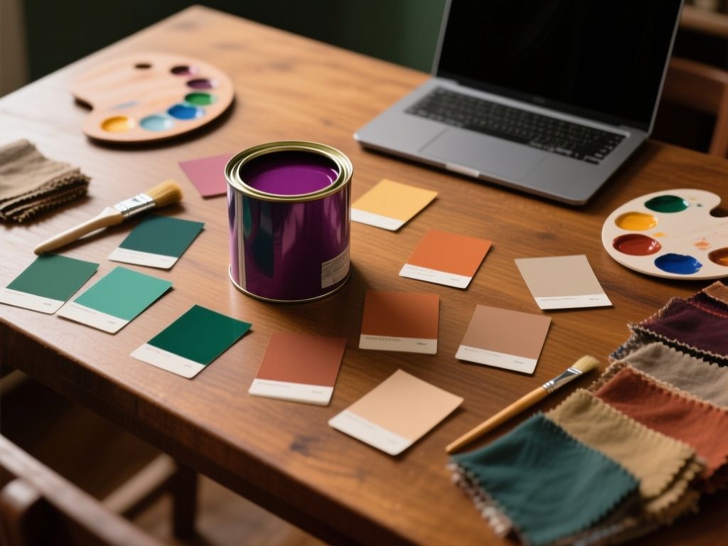
- Don’t skip testing the paint in the actual room — screens and store swatches rarely match what ends up on your wall.
Best Paint Colours for Small Spaces
Small rooms behave differently under paint than large ones, and the wrong choice can make a cramped space feel even tighter. Generally, lighter warm neutrals — the same greige and taupe tones popular for whole-home use — perform well in small spaces because they reflect light without feeling cold. Whites like White Dove work particularly well here, since they brighten a room without the starkness of a pure, cool white.
That doesn’t mean small spaces are limited to pale colours only. A small powder room or reading nook can handle a deeper shade like forest green precisely because the space is enclosed and the colour doesn’t have to carry an entire open-plan area. The key is scale: use bold colour where the room is small enough that it reads as a cohesive, intentional choice rather than something visually overwhelming.
Choosing the Perfect Painting Colours for Bedroom: A Comprehensive Guide
Bedrooms are one of the few rooms where “calm” should almost always be the priority over “trendy.” The warm, grounding shades leading this year’s trends suit bedrooms particularly well, since the goal is usually to create a restful atmosphere rather than a striking one. Evergreen Fog or a similar muted green can work beautifully as a full bedroom colour, not just an accent, because its softness doesn’t compete with rest.
If you want more drama without losing the calm factor, apply the accent-wall approach here too: paint the wall behind the bed in navy or forest green and keep the remaining walls in a warm neutral. This gives the room a focal point without making the whole space feel heavy, and it’s an easier trend to update later than a full room in a bold colour.
A Guide to Matching Paint Colours Already on Your Wall
Not every project starts from scratch. If you’re touching up a room or extending an existing colour into a new area, matching what’s already there matters more than following any trend list. A Guide to Matching Paint Colours Already on Your Wall starts with finding out the original product, if possible — a receipt, a label on a leftover can, or a note from a previous owner. Paint stores can also scan a chip of dried paint or a swatch cut from the wall and produce a close match, though results vary depending on how faded or aged the existing paint is.
When no record exists, bring the largest sample you can — a chunk of drywall, a door, or a removable panel — rather than relying on memory or a photo, since lighting and camera settings distort colour significantly.
Tips on Testing Paint Samples and Choosing Colours Based on Lighting
Lighting changes a colour more than almost any other factor, which is why the same swatch can look completely different in two rooms. A few practical habits make this easier to manage:
- Paint a sample directly on the wall, not just on paper, since wall texture and surrounding colours affect the result.
- View the sample at different times of day — morning light, midday, and evening artificial light all shift how a colour reads.
- Check the sample on more than one wall in the room, since natural light rarely hits every wall the same way.
- Compare warm and cool bulb temperatures if the room uses artificial lighting most of the time.
This step matters even more with darker accent colours like navy or forest green, since these shades can shift dramatically between looking rich and looking flat depending on the light source.
Final Thoughts
This year’s palette rewards a fairly simple approach: warm neutrals for the bulk of your home, and a stronger colour like navy or forest green where you want a single space to stand out. None of these choices require chasing a passing trend — they’re versatile enough to still look intentional well after the “trend” label wears off, provided you test them properly in your own space and lighting first.
Read also
- Tips on Testing Paint Samples and Choosing Colors Based on Lighting
- Choosing the Perfect Painting Colors for Bedroom: A Comprehensive Guide
- How to Choose Paint Colors
- Painted living room ideas: transforming spaces with color
- Tips for Kitchen Painting
- Choosing the Best Brands of Interior Paint