Picking kitchen paint colors isn’t just about finding a shade you like on a swatch. Cabinets set the undertone for the whole room, and white and oak are two of the most common — and most different — starting points. White cabinets ask for restraint and warmth, while oak brings its own orange cast into the mix that the wall colour either calms or amplifies. Here’s how to approach both.
Why Cabinet Colour Changes the Equation
White cabinets reflect a lot of light, so whatever colour sits next to them gets pulled into sharper focus. A wall that leans too cool can make white cabinets look clinical and flat, almost sterile under certain lighting. Oak, on the other hand, is a wood tone with visible grain and a warm, often orange-leaning undertone. Painting around oak means deciding whether you want to soften that orange cast or let it stand out as a feature. Neither cabinet type is neutral in the way a blank wall is — they both bring colour information into the room that the paint has to respond to.
Kitchen Paint Colors With White Cabinets
The biggest mistake with white cabinets is reaching for a stark, cool white or a pale grey-blue on the walls, assuming “neutral” means “safe.” In practice, a cooler wall colour next to white cabinetry can wash out the warmth of the room and make it feel sterile rather than clean.
A warm white on the walls tends to work better. It keeps the cabinets looking bright and fresh without introducing the harshness that a cooler white can bring. The warmth doesn’t compete with the cabinets — it simply gives the room a softer, more lived-in feel while still reading as a bright, light kitchen.
Soft greige is another strong option. It sits between beige and grey, which makes it flexible enough to bridge white cabinets with other materials in the kitchen — a beige stone countertop, grey tile, or natural wood flooring or shelving. Rather than picking a side between warm and cool, greige balances both, which is useful if your kitchen already has a mix of finishes that don’t share one obvious undertone.
Good Starting Points for White Cabinets
- Warm white: keeps the room bright without the starkness of a cool-toned white
- Soft greige: balances beige, grey, and natural-wood elements in the same space
- Avoid pairing white cabinets with a wall colour that’s noticeably cooler than the cabinets themselves — the contrast tends to make the white look dull by comparison
Kitchen Paint Colors With Oak Cabinets
Oak is trickier because the wood itself carries colour. Many oak cabinets — especially older, honey-toned or golden oak — have a visible orange undertone. The wall colour you choose will either sit alongside that orange comfortably or clash with it.
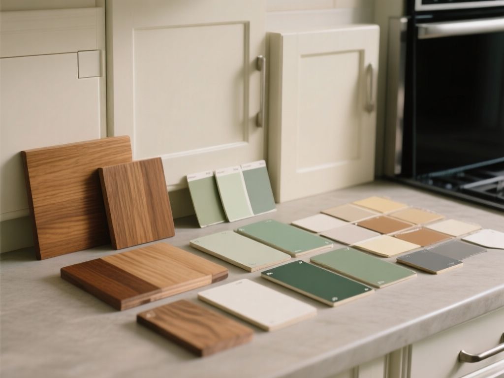
Warm cream tones are a dependable choice. Because cream already leans warm, it doesn’t fight the orange in the oak; instead, it complements it, so the two work together rather than pulling in different directions. This is a good route if you like the warmth of oak and want the room to feel cohesive rather than corrected.
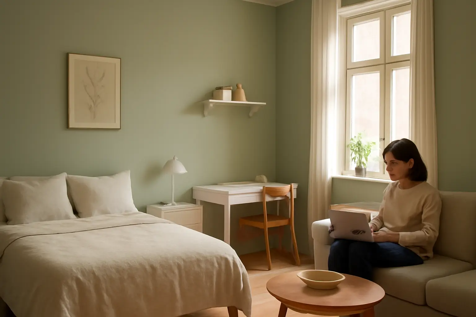
If your goal is the opposite — toning down the orange rather than embracing it — blue or blue-green walls are worth considering. Blue and orange sit opposite each other, and in practice, cooler blue or blue-green tones can visually reduce how intense the orange in oak cabinets appears. This doesn’t change the cabinets themselves, but it shifts how the eye reads them in the room, making the oak feel less dominant and more balanced against the wall colour.
Good Starting Points for Oak Cabinets
- Warm cream: complements oak’s orange undertones instead of intensifying them
- Blue or blue-green: visually softens the orange cast of oak cabinetry
- Be cautious with warm yellows or oranges on the wall — they can intensify the oak’s undertone rather than balance it
Always Test the Colour in Your Own Kitchen
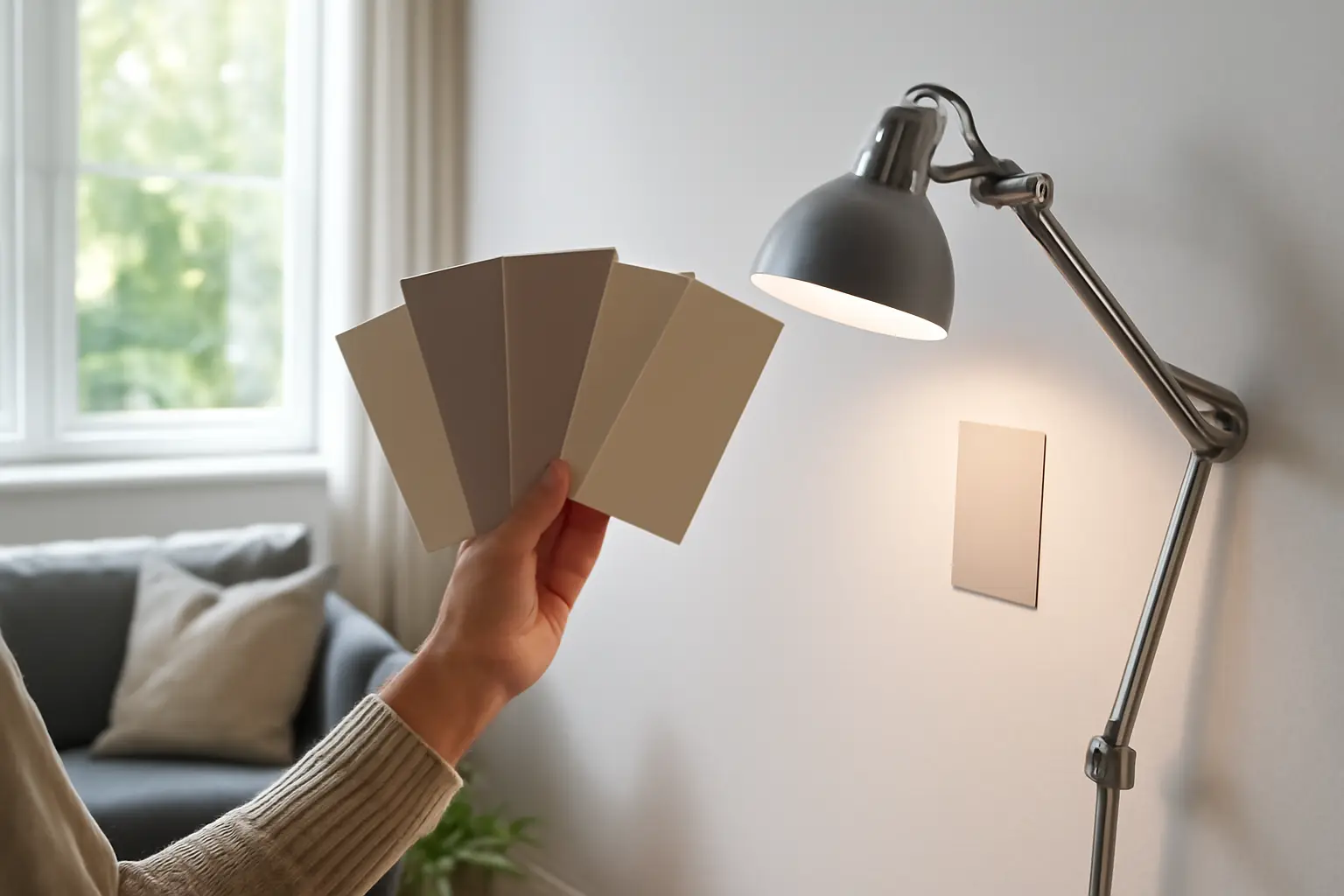
No swatch or online colour chip tells the full story. Daylight changes throughout the day, and artificial lighting in the evening can shift how a colour reads entirely. A warm cream that looks ideal at noon might turn slightly pink under warm-toned bulbs at night. The only reliable way to know how a paint colour will actually work is to test it directly beside your cabinets, in your kitchen, under the lighting you actually use.
Paint a sample patch — ideally a reasonably sized one, not just a few inches — next to both the cabinets and any countertop or backsplash material already in the room. Look at it in the morning, in bright afternoon light, and again at night. Undertones that aren’t obvious in one type of light can become very noticeable in another, and it’s far easier to catch that on a test patch than after the whole kitchen is painted.
Final Thoughts
There’s no single “correct” wall colour for a kitchen — it depends on the cabinets you’re working with and how you want the room to feel. White cabinets generally respond well to warmth, whether that’s a warm white or a balanced greige. Oak cabinets give you a choice: lean into the wood’s warmth with cream, or counter it with blue and blue-green tones. Whichever direction you choose, test it on-site before committing, since the way a colour behaves on a chip and the way it behaves on your actual walls can be two different things.