Hallways rarely get much natural light, and most are narrow by design. That combination makes them feel like leftover space rather than a proper part of the home. The good news is that paint alone can fix a lot of this. The right hallway paint colors reflect what little light is available, push walls back visually, and turn a cramped corridor into something that actually feels welcoming.
Why Hallways Need a Different Approach Than Other Rooms
A living room or bedroom usually has at least one window and enough floor area to absorb a bold colour choice. Hallways don’t have that luxury. They’re often windowless, lit by a single overhead fixture, and flanked by doors that eat into wall space. Any colour you choose here has to work harder — it needs to bounce light rather than absorb it, and it needs to read as open rather than enclosing.
White: The Default for a Reason
White reflects more light than any other colour, which is exactly what a dim, narrow hallway needs. Walls painted white don’t just look clean — they genuinely bounce available light back into the space, making it feel larger and more open than it is. This is why so many estate agents and interior designers fall back on white for entryways: it’s not a lack of imagination, it’s physics. A soft, warm white also avoids the stark, clinical look that a cooler white can bring to a space with no daylight to balance it.
Light Gray for a Softer, More Contemporary Feel
If plain white feels too flat, light gray is the next best option. Eggshell and silver-toned grays still reflect light effectively while adding a bit more depth and sophistication than white alone. These tones work particularly well in small entryways, where they help visually expand the walls without making the space feel sterile. A pale gray also tends to hide scuffs and fingerprints better than white, which matters in a high-traffic zone where bags, coats, and shoes pass through daily.
Cream: Warmth Without Losing Brightness
Cream sits in a useful middle ground. It carries the brightness of white but adds the warmth of beige, so the hallway feels inviting rather than cold. This is a good choice if the rest of the home leans toward warmer tones — wood flooring, warm-toned furniture, or natural materials — since a stark white hallway can feel disconnected from that palette. Cream bridges the gap while still doing the job of reflecting light and keeping the space feeling airy.
Pale Blues and Greens: Colours That Push Walls Back
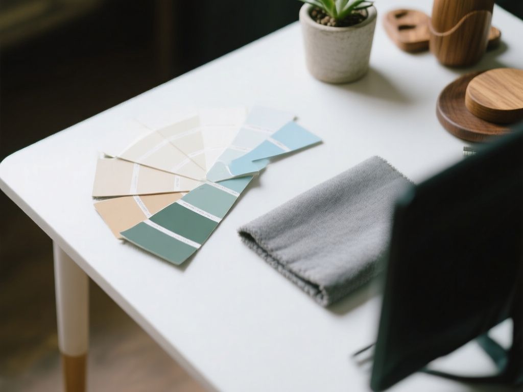
Not every bright hallway needs to be neutral. Pale blues and soft greens are what designers call receding colours — shades that visually retreat rather than advance, which makes a tight hallway appear bigger than its actual dimensions. Unlike saturated versions of these colours, which can feel heavy in a small space, the pale, washed-out versions keep things light while adding a bit of personality that plain white or cream can’t offer. These work especially well in hallways that connect to a garden view or have even a small amount of natural light, since blues and greens tend to pair naturally with that kind of context.
Pale Yellow for Hallways With No Natural Light
Some hallways have no windows at all — just a run of doors and a single light fixture. In these cases, pale yellow can do something the other colours can’t: it mimics the effect of sunlight. A soft, muted yellow on the walls creates a warmer, more cheerful atmosphere even when there’s no actual daylight reaching the space. It’s worth testing the shade under your actual lighting before committing, since yellow can shift quite a bit depending on whether the bulbs are warm or cool-toned, but used well it’s one of the most effective fixes for a genuinely dark corridor.
Choosing Between These Options
There’s no single “correct” answer among these hallway paint colors — the right one depends on the hallway itself and the rest of the home around it. A few practical points to weigh up:
- How much natural light the hallway actually gets, if any
- Whether the hallway connects visually to other rooms with their own colour schemes
- How much wear and tear the walls take from daily traffic
- Whether you want the hallway to feel calm and neutral, or to have a bit of character
A Simple Way to Test Before Committing
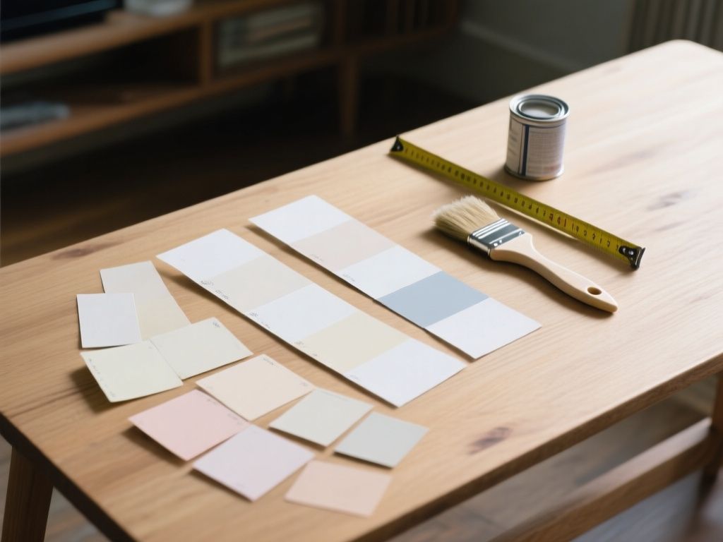
Paint a sample patch on more than one wall, and check it at different times of day. A hallway with no windows will look different under morning light coming from an adjoining room versus at night under artificial lighting. Since hallways are usually small, a full tester pot goes a long way, and it’s far cheaper than repainting the whole space after discovering the colour reads differently than expected.
Final Thoughts
Hallways don’t need to be an afterthought. Whether you lean toward a clean white, a soft gray, a warm cream, a pale blue or green, or a sunlight-mimicking yellow, the goal is the same: get as much light bouncing around that narrow space as possible. Get the colour right, and even the smallest, darkest entryway can feel noticeably bigger and brighter the moment you walk through the door.
Read also
- A Guide to Matching Paint Colors Already on Your Wall
- Best Paint Colors for Bedrooms: How to Choose the Right Shade
- Kitchen Paint Colors: What Works Best With White and Oak Cabinets
- Painted living room ideas: transforming spaces with color