The colour on your home office walls does more than decorate the room. It sits in your field of vision for hours a day, and it can either help you settle into work or quietly wear down your attention. Choosing the right home office paint colors is less about trends and more about matching a shade to how you actually work and how much light your room gets.
Why Colour Choice Matters in a Workspace
A home office is a different kind of room from a bedroom or a living space. You’re not trying to relax completely, and you’re not trying to energise a crowd. You need a background that keeps you steady during long stretches of concentration, without becoming dull or distracting. That’s why certain colour families keep coming up in advice for workspaces: they strike a balance between calm and alertness rather than pushing hard in one direction.
Soft Blue for Concentration
Soft blue is one of the most recommended home office paint colors, and for good reason. It has a calming effect that can make it easier to settle into focused tasks without feeling flat or sleepy. A pale or muted blue, rather than a bright or saturated one, tends to work best — it keeps the room feeling composed instead of cold.
This shade suits work that demands sustained attention: writing, analysis, reading, or anything where a wandering mind is the main obstacle. If your office doubles as a reading nook or a space for video calls, soft blue also photographs and reads well on camera, which is a small but useful bonus.
Green for Creativity and Focus Together
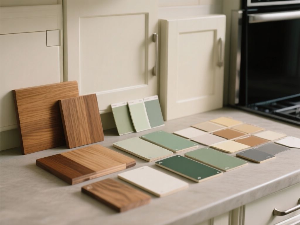
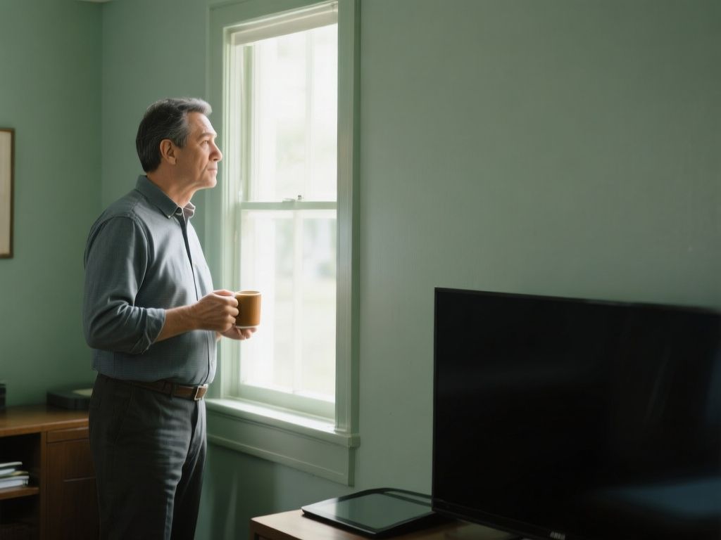
Green occupies a useful middle ground. It can promote both creativity and focus, which makes it a strong option if your work shifts between analytical tasks and more open-ended thinking, such as design, writing, or planning. At the same time, green creates a peaceful background that doesn’t compete for attention the way a bold colour would.
Lighter, more muted greens — sage, soft olive, pale eucalyptus — tend to work better in a workspace than saturated ones. A deep, vivid green can feel lively in a living room but overwhelming in a space meant for sitting still and thinking.
Warm Gray for Detail-Oriented Work
If your work involves spreadsheets, editing, coding, or anything that depends on precision rather than inspiration, warm gray is worth considering. It provides a muted, neutral setting that supports detail-oriented work by staying out of the way visually. Unlike a stark, cool gray, a warm gray avoids feeling clinical or sterile.
Gray also pairs easily with wood furniture, metal shelving, and most desk accessories, which makes it a low-risk choice if you’re not planning to redecorate the whole room around the paint colour.
Blue-Green Shades for a Balanced Feel
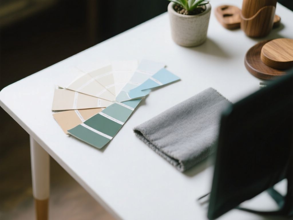
Blue-green shades — teal, sea glass, muted turquoise — combine the calming qualities of blue with the balanced, natural feel of green. This makes them a sensible compromise if you’re torn between the two: you get some of blue’s steadying effect alongside green’s more grounded, organic quality.
These shades tend to suit offices that get a good amount of natural light, where a richer tone won’t make the room feel heavy.
Matching Colour to Light and Room Size
Before settling on a shade, consider two practical factors:
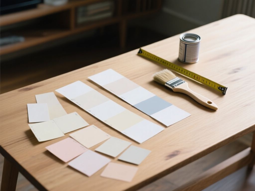
- Natural light. A north-facing room with little direct sun will show cooler colours differently than a sunny south-facing one. Test a sample on the actual wall at different times of day before committing.
- Room size. In a small home office, lighter colours can make the room feel more open and less cramped. If your workspace is a converted closet or a narrow corner, lean towards the paler end of whichever colour family you choose.
Choosing Between the Options
There’s no single best answer among these home office paint colors — the right one depends on your work and your room:
- Choose soft blue if your main challenge is staying focused during long, uninterrupted work.
- Choose green if your work mixes creative and analytical tasks and you want a calm but flexible background.
- Choose warm gray if precision and detail matter more than mood, and you want something neutral that won’t date quickly.
- Choose a blue-green shade if you want elements of both blue and green without fully committing to either.
A Few Practical Notes Before Painting
Paint finish matters almost as much as colour in a workspace. A matte or eggshell finish on the walls will reduce glare on video calls and reduce reflections on a monitor compared with a semi-gloss. If your desk faces a window, test your chosen colour on the wall behind your screen first, since that’s the wall you and anyone on a call will actually be looking at most of the day.
It’s also worth testing a sample patch for a few days rather than judging from a paint chip alone. Colour can look noticeably different under morning light, midday light, and the artificial light you’ll be using in the evening.
Conclusion
None of these colours will do the work for you, but the right background can remove one small source of friction from a long day at a desk. Soft blue, green, warm gray, and blue-green shades each offer a different balance of calm and focus — match the shade to your room’s light, its size, and the kind of work you actually do there, and the paint on the walls will stop being a distraction and start being part of the setup.
Read also
- A Guide to Matching Paint Colors Already on Your Wall
- Best Living Room Paint Colors That Work With Grey Furniture
- Best Paint Colors for Bedrooms: How to Choose the Right Shade
- Best Paint Colors for Small Spaces