Choosing bathroom paint colors is different from picking a shade for a living room or bedroom. Bathrooms are often small, sometimes windowless, and used in moments when you want to feel calm rather than stimulated. The right color can make a cramped space feel open, turn a quick shower into something closer to a spa visit, and hide the fact that the room gets limited natural light. The wrong one can make the same space feel cold, cramped, or oddly clinical.
This guide breaks down the color families that consistently work well in bathrooms, why they work, and where each one makes the most sense.
Soft Whites for Brightness and Space
White remains one of the most reliable bathroom paint colors, particularly in rooms with no window or only a small one. Soft whites reflect artificial light rather than absorbing it, which helps a dim bathroom feel brighter and visually larger than it actually is. This matters more in bathrooms than almost any other room, since many of them rely entirely on overhead or vanity lighting.
Related: A Guide to Matching Paint Colors Already on Your Wall and Bathrooms should be painted with a special kind of paint.
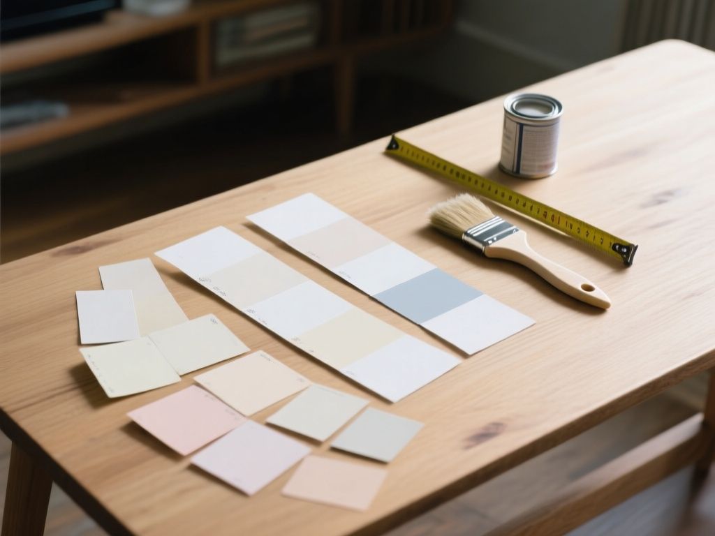
Not all whites behave the same way. Warmer whites with a hint of cream or beige tend to feel softer and less sterile, while cooler whites can read as crisp and modern but risk feeling flat under certain bulbs. It’s worth testing a sample patch under the bathroom’s actual lighting before committing, since the same white can look very different next to tile, fixtures, and artificial light compared to how it appears on a paint chip.
Pale Blues for a Spa-Like Calm
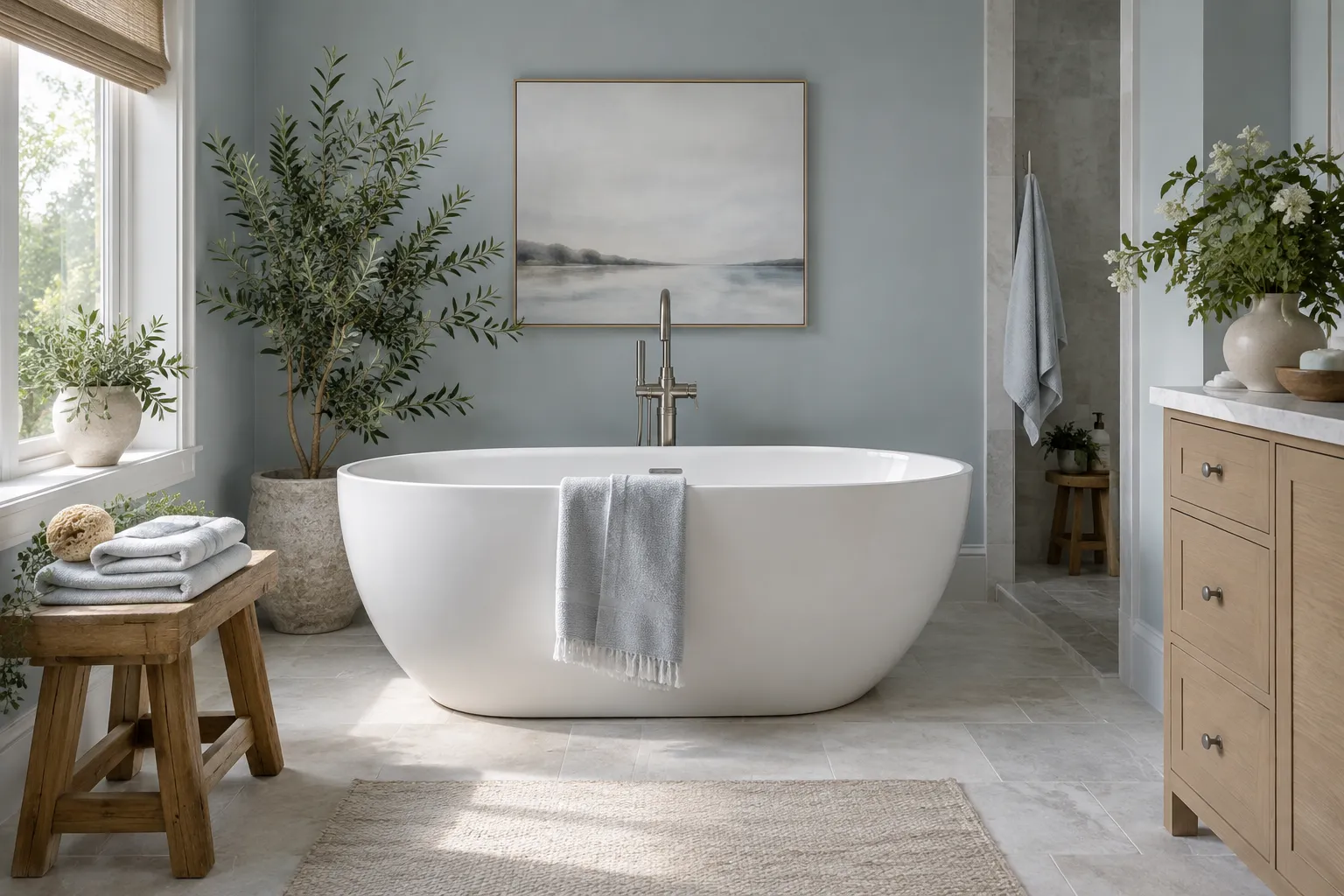
Pale blue is one of the most direct ways to bring a spa-like feeling into a bathroom. The color naturally evokes water, which makes it an intuitive fit for a room built around washing and bathing. Light, muted blues in particular create a calm atmosphere without feeling cold, especially when paired with white trim, natural wood accents, or simple stone-look tile.
Lighter blues work well in smaller bathrooms where you still want the brightening effect of a pale color, while slightly deeper blue-grays can add a bit more depth in larger spaces without losing that watery, relaxed quality.
Muted Greens for a Nature-Inspired Feel
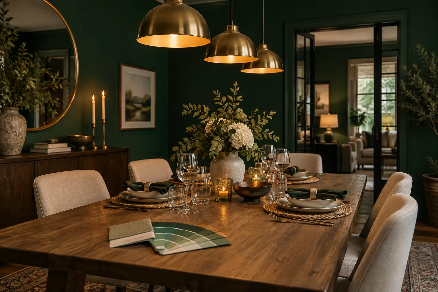
Muted greens bring a different kind of calm to a bathroom—one tied more to nature than to water. Soft sage, pale eucalyptus, and other desaturated greens can make a bathroom feel grounded and peaceful, especially when the room includes plants, wood tones, or natural materials like woven baskets or linen towels.
Because these greens are muted rather than bright or saturated, they avoid feeling overly bold or theme-y. They tend to sit quietly in the background, which suits a room meant for unwinding rather than making a strong visual statement.
Light Grays for a Neutral, Serene Backdrop
Gray is often treated as a safe, almost default choice, but in bathrooms it earns that reputation. Light grays provide a serene, neutral backdrop that works with almost any fixture color, tile pattern, or hardware finish. Unlike plain white, gray can add a bit of warmth or coolness depending on its undertone, without tipping the room into feeling clinical or sterile.
This makes light gray a practical middle ground for anyone who wants a calm, neutral bathroom but finds pure white a little too stark or hospital-like. A gray with warm undertones pairs especially well with wood vanities and warm metal fixtures, while a cooler gray suits bathrooms with marble or chrome.
Deeper Colors for Drama in the Right Spaces
Not every bathroom needs to lean toward pale and soothing. Charcoal, navy, and other deep colors create a more dramatic effect, and they work particularly well in powder rooms or larger bathrooms. In a small powder room used mainly by guests, a bold dark color can feel intentional and striking rather than overwhelming, since the space is typically viewed briefly and doesn’t need to feel expansive.
In larger bathrooms, deep colors can add a sense of richness and coziness, especially when balanced with plenty of light fixtures, mirrors, and lighter-colored tile or countertops. The key is scale: a dark color that feels sophisticated in a spacious bathroom can feel heavy and closed-in in a cramped one.
Matching Color to Room Size and Light
- Small, windowless bathrooms: soft whites or very pale blues and grays, to maximize reflected light.
- Bathrooms with natural light: muted greens or light grays, which read well in both daylight and artificial light.
- Powder rooms: deeper colors like charcoal or navy, where drama works in a space that’s seen briefly.
- Larger bathrooms: deeper tones balanced with light fixtures, mirrors, and pale countertops or tile.
Bringing It Together
There’s no single “correct” answer among bathroom paint colors—the right choice depends on the room’s size, how much natural light it gets, and the mood you’re after. Soft whites and pale blues lean toward bright and calming, muted greens add a natural softness, light grays offer a flexible neutral base, and deeper colors like charcoal or navy bring drama where the space can support it. Testing a color under the bathroom’s actual lighting, rather than relying on how it looks in the store or on a screen, remains the most reliable way to avoid surprises once the paint is on the wall.
Read also
- Best Living Room Paint Colors That Work With Grey Furniture
- Best Paint Colors for Bedrooms: How to Choose the Right Shade