The dining room is one of the few spaces in a home built around a single ritual: sitting down together to eat. The colour on the walls does more work than people often credit it for, shaping how a room feels before anyone even takes a seat. Choosing the right dining room paint colors means thinking about light, the size of the space, and the kind of meals you actually host there, not just what looks good in a photograph.
Why Color Matters at the Table
Unlike a bedroom or office, a dining room is usually occupied for short, focused stretches of time. That makes the emotional effect of a wall colour more immediate. A shade that feels flat in passing can suddenly dominate the room once you’re sitting at the table for an hour with nothing else to look at. This is why dining room paint colors tend to split into a few clear categories: calm and neutral, warm and grounding, soft and romantic, or bold and formal.
Related: Painted living room ideas: transforming spaces with color.
Warm and Earthy Choices
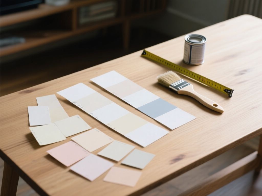
Neutral doesn’t have to mean cold. Agreeable Gray, a versatile greige, is a popular pick for dining rooms that need to feel brighter and more open, particularly in spaces with limited natural light or smaller square footage. It reads warm enough to avoid feeling clinical, while staying light enough not to close the room in.
For a deeper, more grounded feel, Poised Taupe works well. It combines earthy brown tones with hints of clay and violet, which gives it a warmth that shifts slightly depending on the light and the furnishings around it. This is a good option for dining rooms that double as a gathering space for extended family dinners, where you want the room to feel settled and welcoming rather than stark.
Soft and Romantic Tones
Not every dining room needs to be bold to make an impression. Glamour, a muted blush pink, adds a gentle warmth without tipping into something overly sweet or theatrical. It works particularly well in rooms with a lot of natural light, where a stronger colour might feel overwhelming by midday. This shade suits dining rooms used for quieter, more intimate meals — think weekend brunches or smaller dinner parties — rather than large, high-energy gatherings.
Bold and Formal Choices
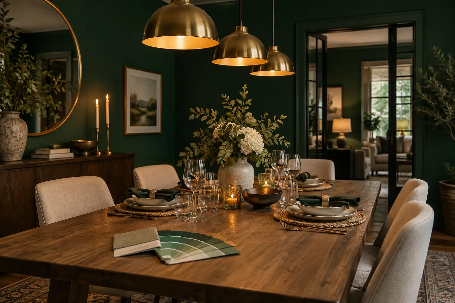
At the other end of the spectrum, classic navy and charcoal gray bring a sense of refinement that suits more formal dining. These darker tones have a way of making a room feel intimate even when it’s large, which is part of why they work equally well for a structured dinner party and a relaxed weekend brunch. The trick with darker dining room paint colors like these is lighting: they rely on good overhead or candle light to avoid feeling heavy, so they tend to suit rooms with a chandelier or several light sources rather than a single overhead bulb.
When Dark Colors Work Best
- Rooms with higher ceilings, where depth of colour doesn’t feel cramped
- Spaces with strong artificial lighting, such as a dimmable chandelier or wall sconces
- Dining rooms used mainly for evening meals, where natural light isn’t a major factor
Color Psychology and Appetite
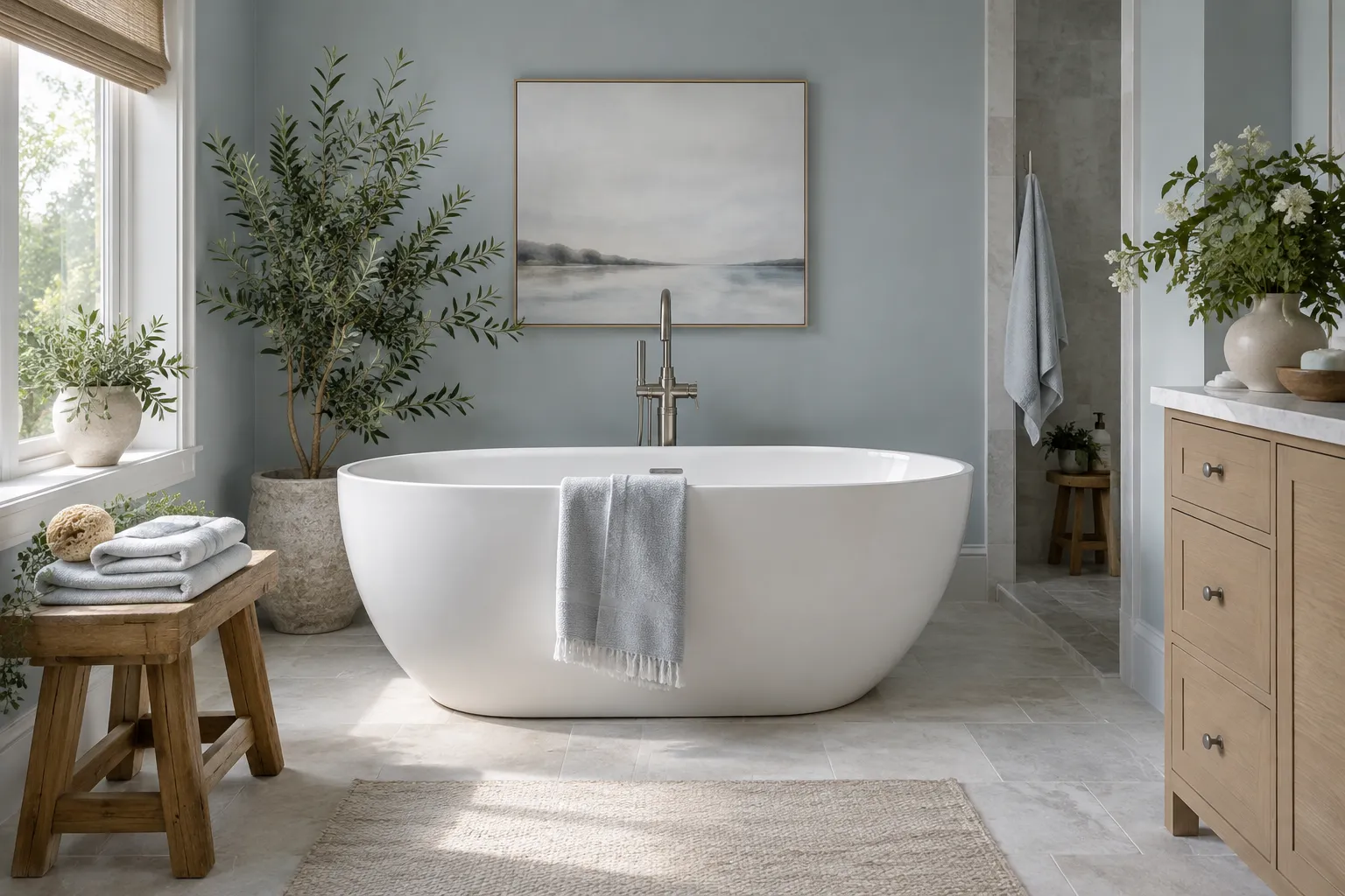
There’s a reason certain colours show up again and again in restaurants and dining spaces. Warm yellow tones are often associated with stimulating appetite and mental alertness, which makes them a reasonable choice for a breakfast nook or a dining room that sees a lot of daytime use. Cool blues, on the other hand, can have the opposite effect — some shades are linked to appetite suppression, which is worth keeping in mind if the room is meant to encourage long, relaxed meals rather than quick ones.
This doesn’t mean blue is off the table entirely. A deep navy used with warm lighting and wood tones can still feel inviting; it’s the cooler, paler blues used in isolation that are more likely to make a room feel detached from the act of eating.
Choosing the Right Shade for Your Dining Room
There’s no single correct answer here, since the best dining room paint colors depend on how the room is actually used. A few practical questions can help narrow things down:
- Does the room get mostly natural light, or is it used primarily in the evening?
- Is it a space for quick family dinners, or more formal entertaining?
- How large is the room, and does it connect visually to the kitchen or living area?
- What’s the dominant tone of the existing furniture and flooring?
A smaller, darker room with limited light usually benefits from something like Agreeable Gray, which opens the space up without washing out its character. A larger room with good light and a chandelier can carry navy or charcoal without feeling closed in. Poised Taupe sits comfortably in between, suited to dining rooms that need warmth more than brightness. Glamour works best where the room is used for softer, smaller gatherings rather than large formal dinners.
Final Thoughts
Paint colour in a dining room isn’t just a backdrop — it directly shapes the mood of every meal eaten there, from quick weekday breakfasts to long weekend dinners. Matching the shade to the room’s light, size, and typical use gives a far better result than picking a colour based on trend alone. Whether that means a warm greige, a grounded taupe, a soft blush, or a confident navy, the right dining room paint colors should make sitting down to eat feel like the natural thing to do in that space.