Choosing living room paint colors isn’t just about picking a shade you like on a swatch. The colour has to work with your furniture, your lighting, and the overall mood you’re going for — whether that’s a cosy reading nook or a sharp, modern space. This guide breaks down colour options by style and walks through how to choose a paint color without the usual trial-and-error mess.
Why Living Room Colors Matter More Than You Think
The living room gets more light exposure, foot traffic, and visual attention than almost any other room in the house. A colour that looks great in a bedroom can feel flat or overwhelming in a living room because of the scale and the natural light it gets throughout the day. That’s why it’s worth treating this choice separately from the rest of your interior paint plan.
Cozy and Warm Styles
If you want a living room that feels inviting rather than sterile, lean into warm, muted tones. These colours absorb light rather than bounce it back, which creates a softer, more relaxed atmosphere.
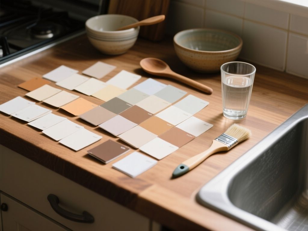
- Terracotta — brings warmth without feeling heavy, works well with wood furniture
- Warm taupe — a safe middle ground between beige and brown, pairs with almost any accent colour
- Deep mustard — adds personality but still reads as earthy and grounded
- Soft terracotta-pink — a muted blush that leans warm rather than sweet
These shades work especially well in rooms with limited natural light, since they don’t rely on brightness to look good.
Modern and Minimalist Styles
Modern living rooms tend to favour clean, controlled palettes. The goal is to let the architecture, furniture, and textures do the talking, so the wall colour stays in the background.
- Soft white or off-white — the default modern choice, but go for one with a slight warm or cool undertone rather than stark white
- Greige — a grey-beige hybrid that reads as neutral but not cold
- Charcoal — works as an accent wall or in rooms with strong natural light that can balance the darkness
- Cool grey — pairs well with black metal fixtures and minimal decor
Why Undertones Matter in Neutral Rooms
Modern palettes rely heavily on neutrals, and neutrals are where undertones become obvious. A “white” paint can lean yellow, pink, or blue depending on the base, and this becomes very visible once it’s on a large wall. Always test a neutral before committing to the full room.
Bold and Statement Styles
Not every living room needs to play it safe. If you want the room to have a strong identity, a bold wall colour can do more work than any piece of furniture.
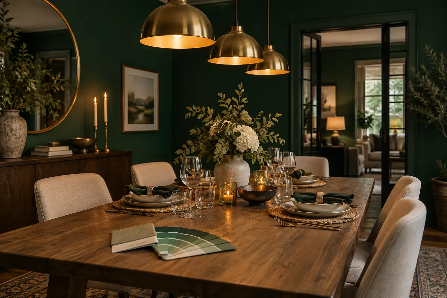
- Deep emerald green — pairs well with brass or gold accents
- Navy blue — reads as sophisticated rather than dark when paired with warm lighting
- Burnt orange — works best as a single accent wall rather than covering the whole room
- Deep burgundy — adds drama, especially in rooms with high ceilings
Bold colours usually work best on one wall rather than all four, unless the room has strong natural light to balance the intensity.
Soft and Transitional Styles
If you don’t want to commit fully to “cosy” or “modern,” transitional colours split the difference. They’re neutral enough to avoid dating the room, but still have enough character to feel intentional.
- Sage green — calm, slightly muted, works with both wood and metal finishes
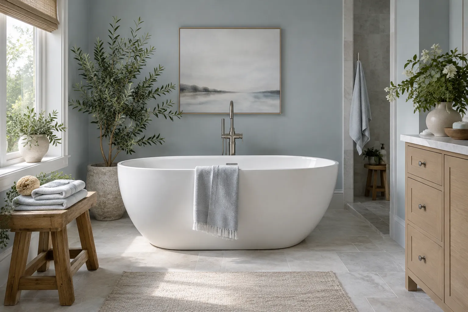
- Dusty blue — soft enough for a relaxed feel without being cold
- Warm grey — a safer alternative to pure grey, less likely to feel sterile
- Soft clay — a muted pink-brown that works in both traditional and modern settings
How to Choose a Paint Color for Your Living Room
With so many living room paint colors available, the real challenge is narrowing things down to what actually fits your space. Here’s a simple process that avoids most common mistakes.
- Check the room’s natural light direction. North-facing rooms get cooler light and often need warmer paint tones to balance it. South-facing rooms get warmer light and can handle cooler colours without feeling cold.
- Look at your fixed elements first. Flooring, built-in shelving, and any stonework around a fireplace aren’t changing anytime soon, so the wall colour needs to work with them, not the other way around.
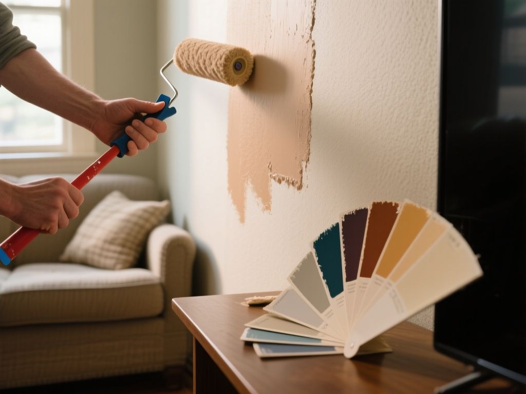
- Test large swatches, not small ones. Paint a section at least 50cm wide on two different walls and check it at different times of day. Small chips don’t show how a colour behaves at scale.
- Decide on the mood before the shade. “Cosy,” “airy,” “bold,” or “calm” is a more useful starting point than a specific colour name. Once you know the mood, narrowing the palette becomes much easier.
- Consider the finish, not just the colour. Matte finishes hide wall imperfections but show less light reflection. Eggshell and satin finishes are more durable and easier to clean, which matters in a high-traffic room like the living room.
Common Mistakes to Avoid
- Choosing a colour based on a photo online without checking it against your room’s actual lighting
- Ignoring the undertone of “neutral” colours
- Painting the whole room in a bold colour instead of testing it as an accent wall first
- Skipping the sample stage entirely and going straight to the full can
Final Thoughts
There’s no single “best” colour for a living room — it depends on the light, the furniture, and the mood you’re aiming for. What matters more is testing properly before committing, since even a well-chosen colour can look wrong if it’s applied without checking how it behaves in your specific space.
Read also
- How to Choose Paint Colors
- Best Paint Colors for Bedrooms: How to Choose the Right Shade
- Dining Room Paint Colors That Set the Mood for Every Meal
- Painted living room ideas: transforming spaces with color